
Sidebar
colormaps
This is an old revision of the document!
pyplot colormaps
This is an overview over all the matplotlib colormaps and how they look in images.
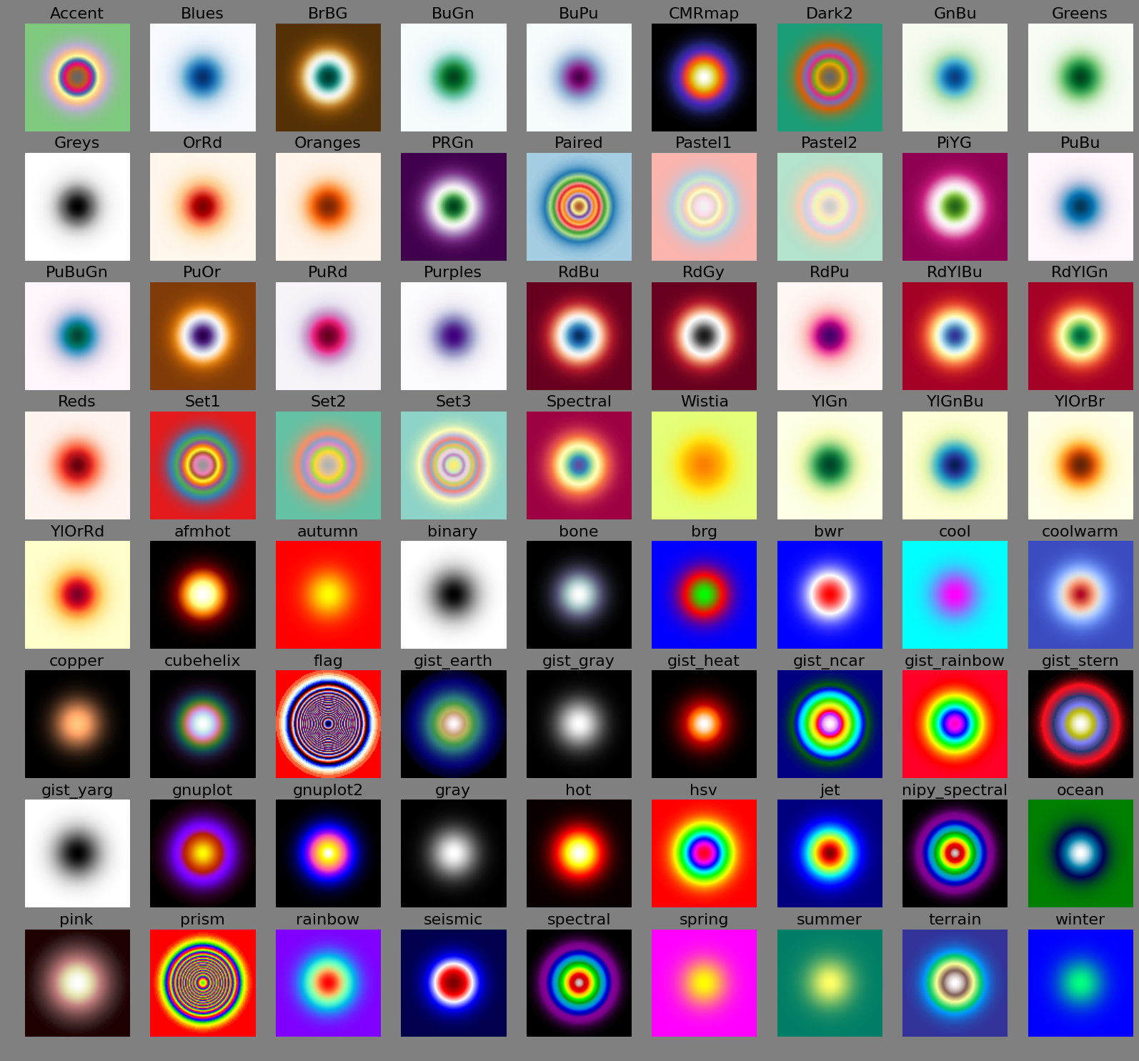
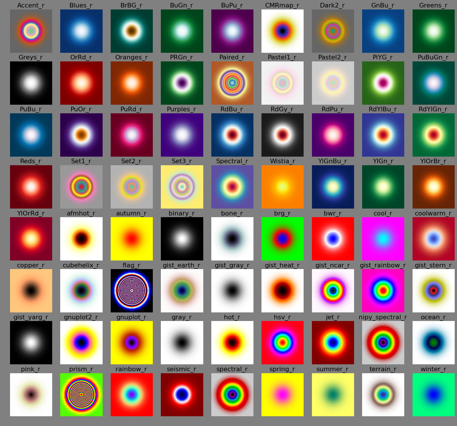
This is sequential data, ranging from 0.0 to 1.0 as a Gaussian. Note how rings suggest qualitative thresholds in the data. Usually, you'll want to avoid them.
Normal order
Reverse order
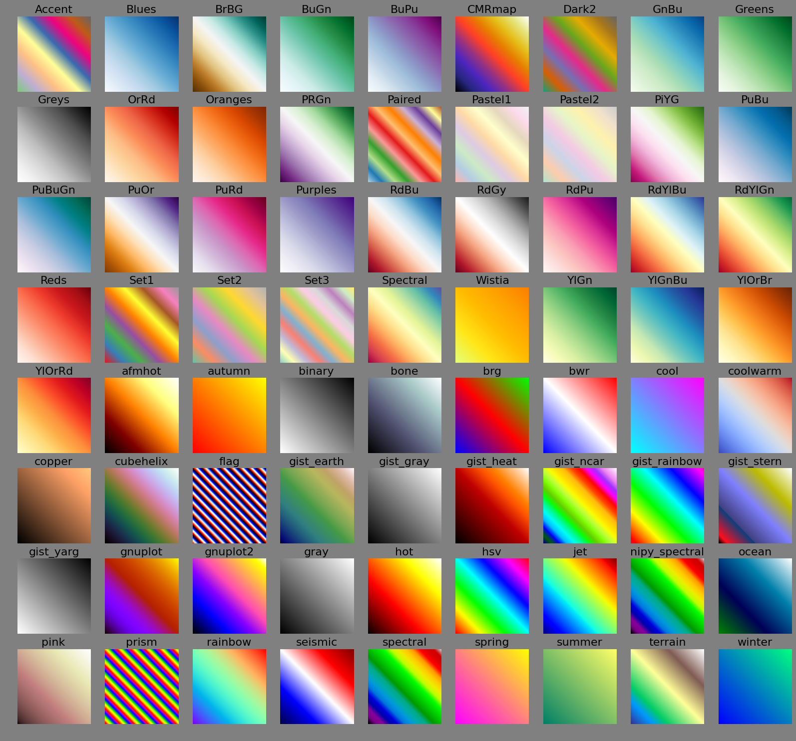
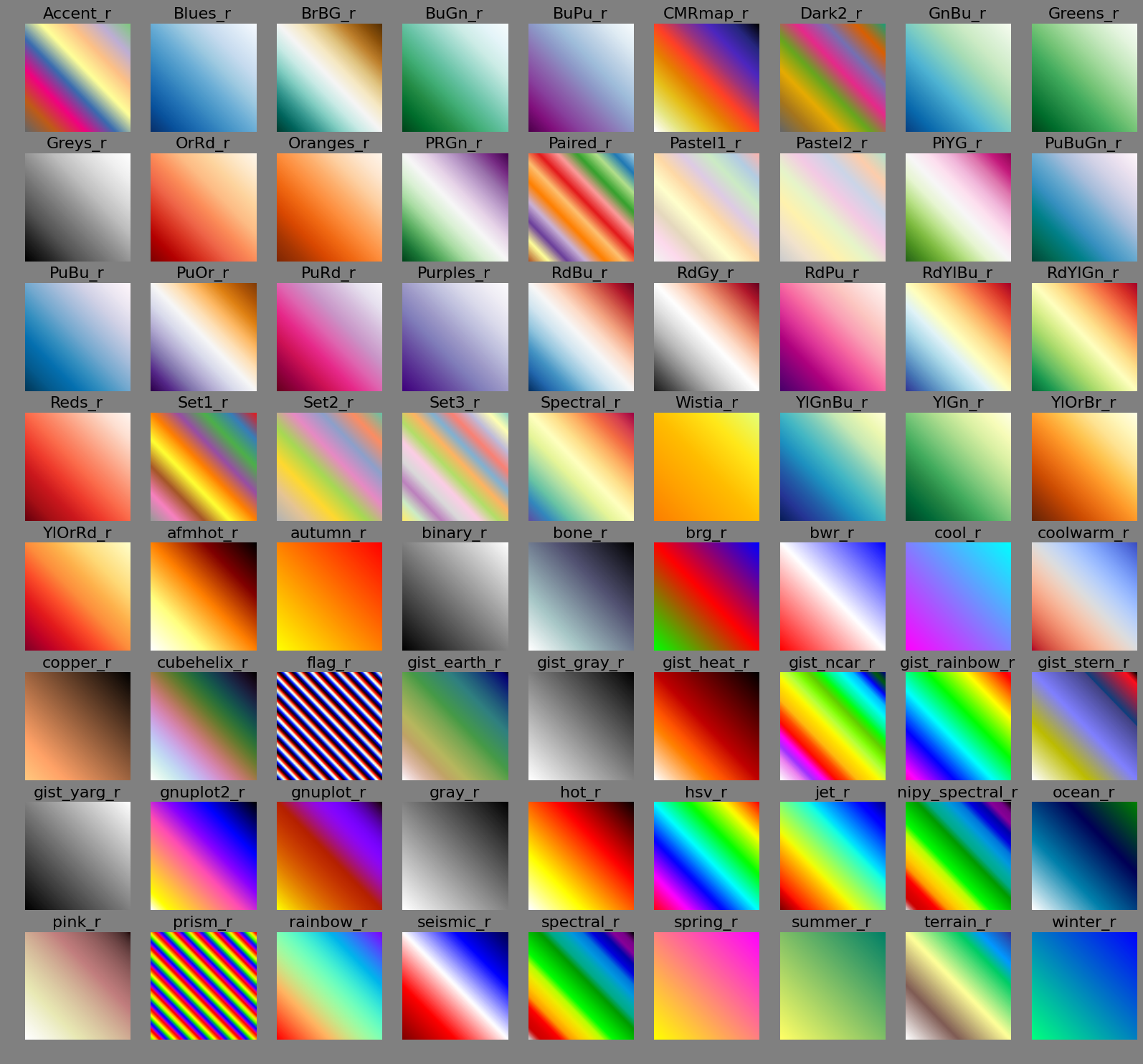
This is divergent data, ranging from -1.0 to 1.0 linearly. Some colormaps suggest a qualitative division into separate ranges (e.g. negative/zero/positive etc.)
Normal order
Reverse order
colormaps.1418139100.txt.gz · Last modified: 2014/12/09 16:31 by wombat