
Sidebar
colormaps
pyplot colormaps
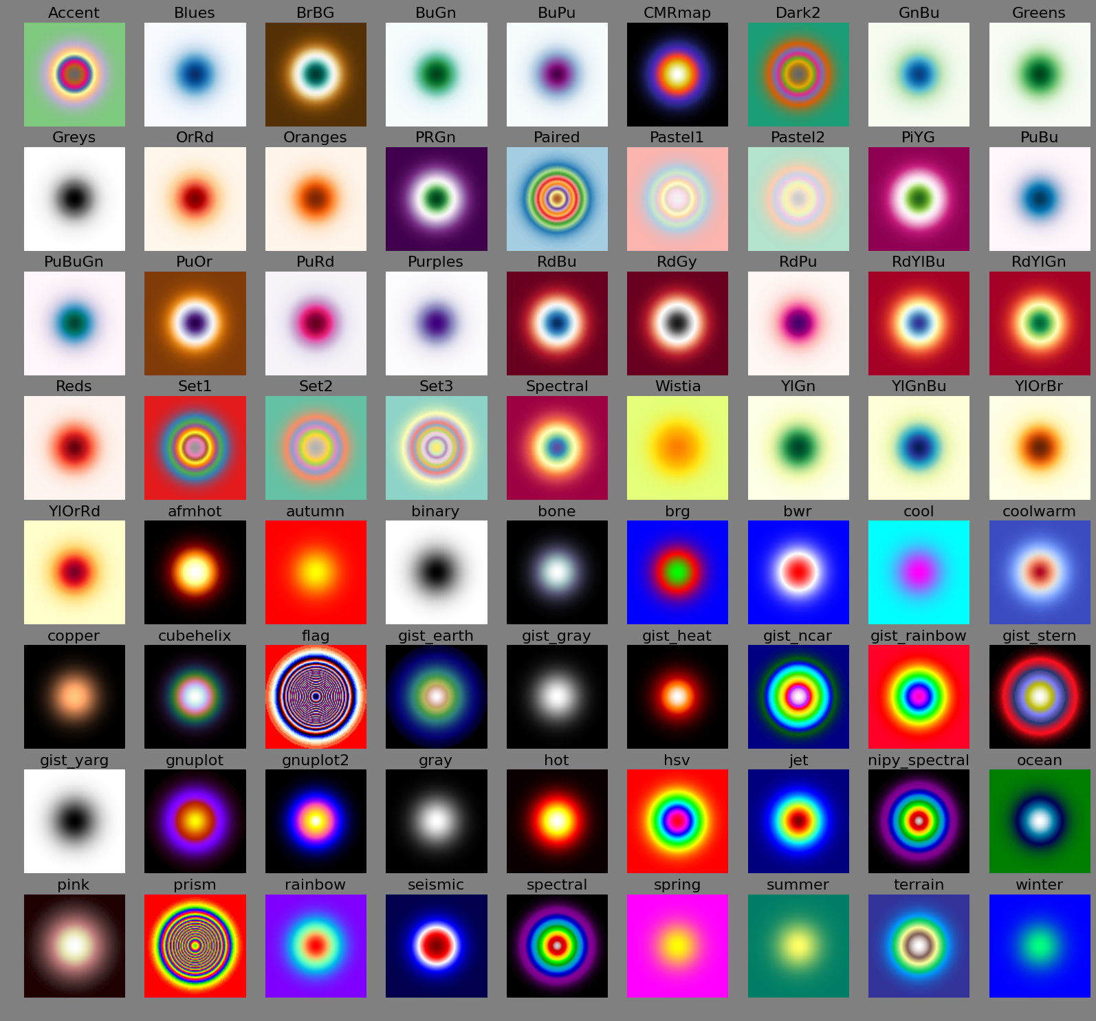
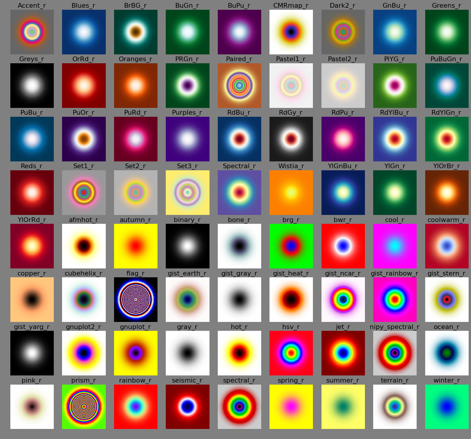
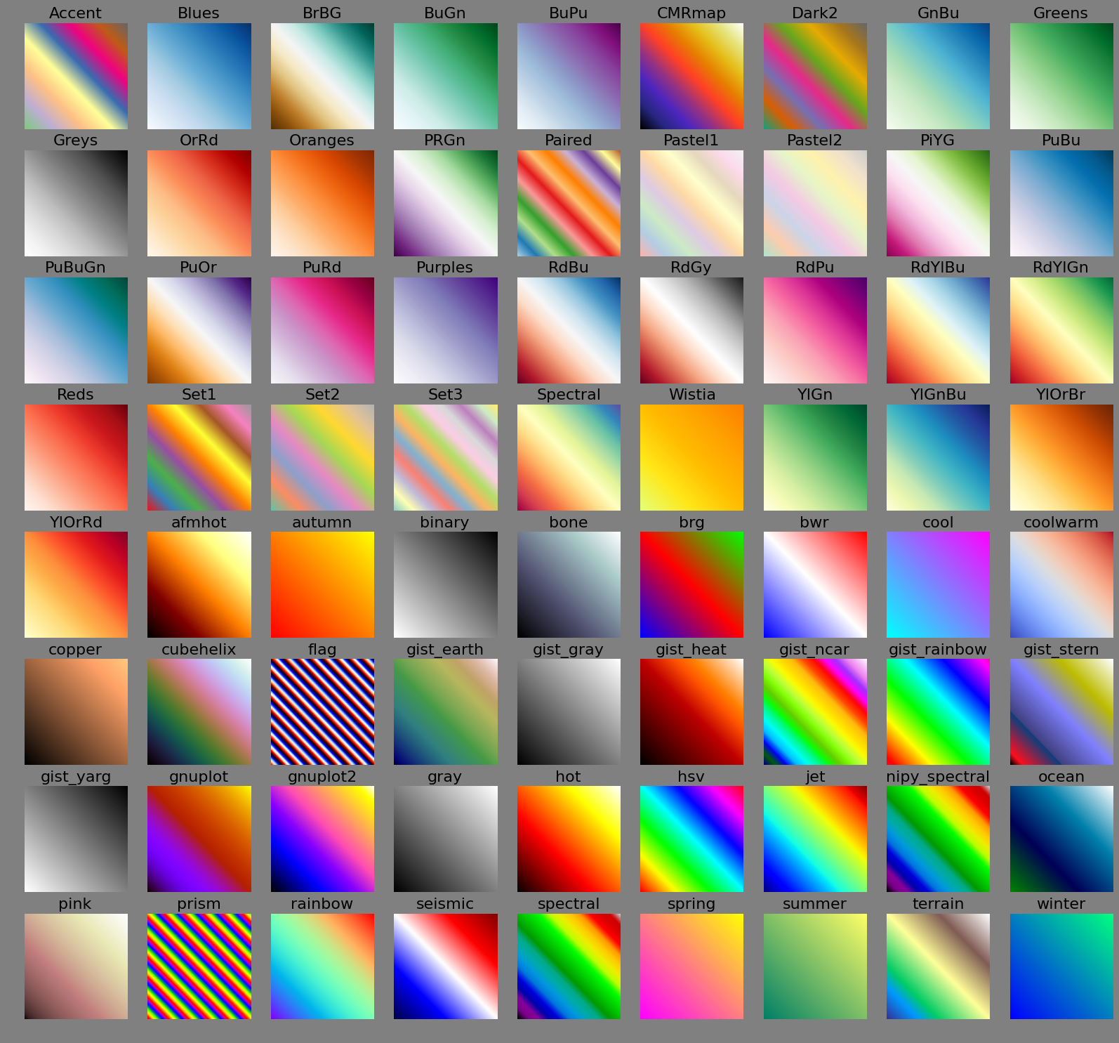
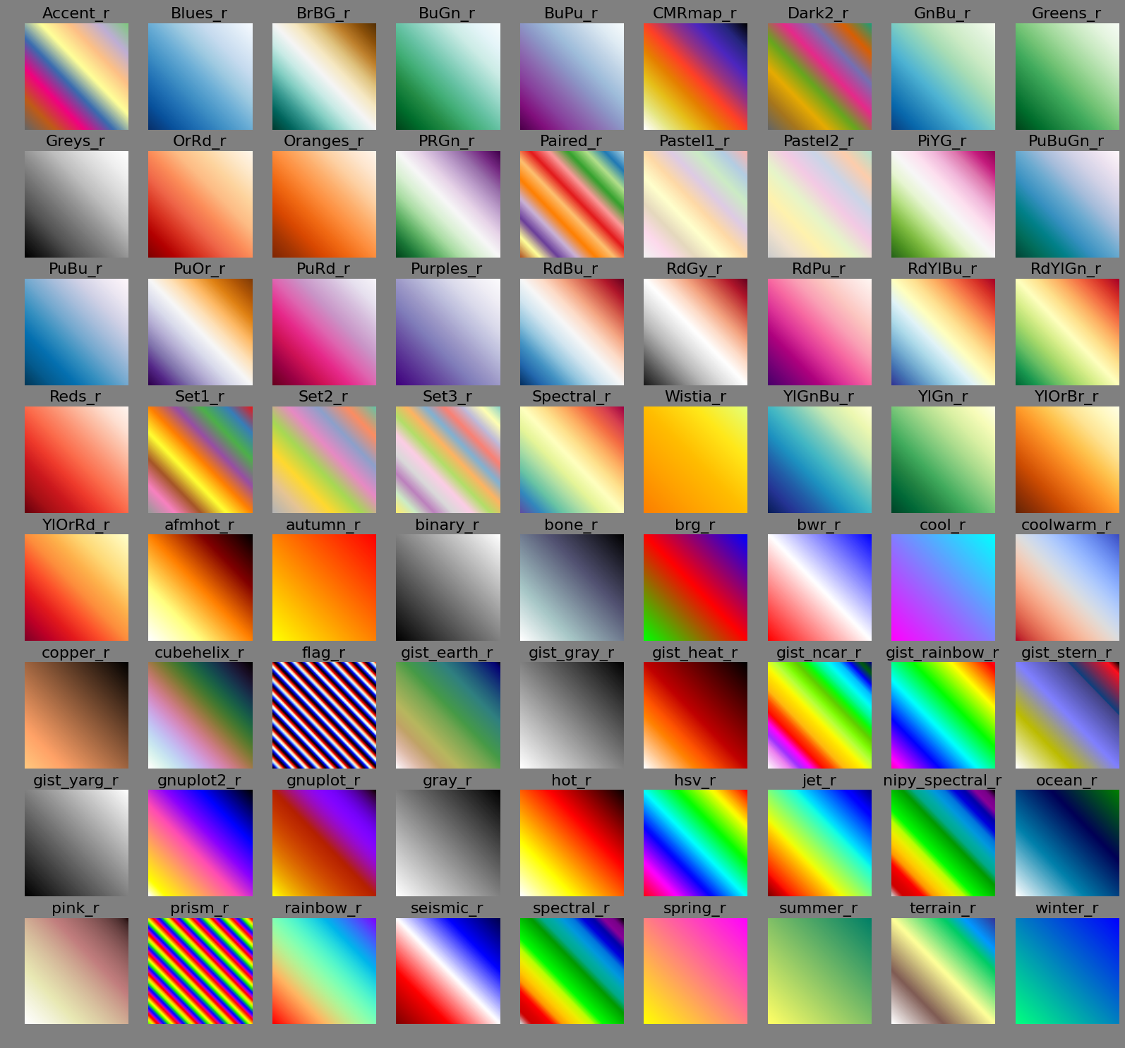
This is an overview over all the matplotlib colormaps and how they look in images.
This is sequential data, ranging from 0.0 to 1.0 as a Gaussian. Note how rings suggest qualitative thresholds in the data which are not present a priori.
Normal order
Reverse order
This is divergent data, ranging from -1.0 to 1.0 linearly. Some colormaps suggest a qualitative division into separate ranges (e.g. negative/zero/positive etc.)
Normal order
Reverse order
colormaps.txt · Last modified: 2014/12/09 16:32 by wombat